Keel
A money app for the bad weeks
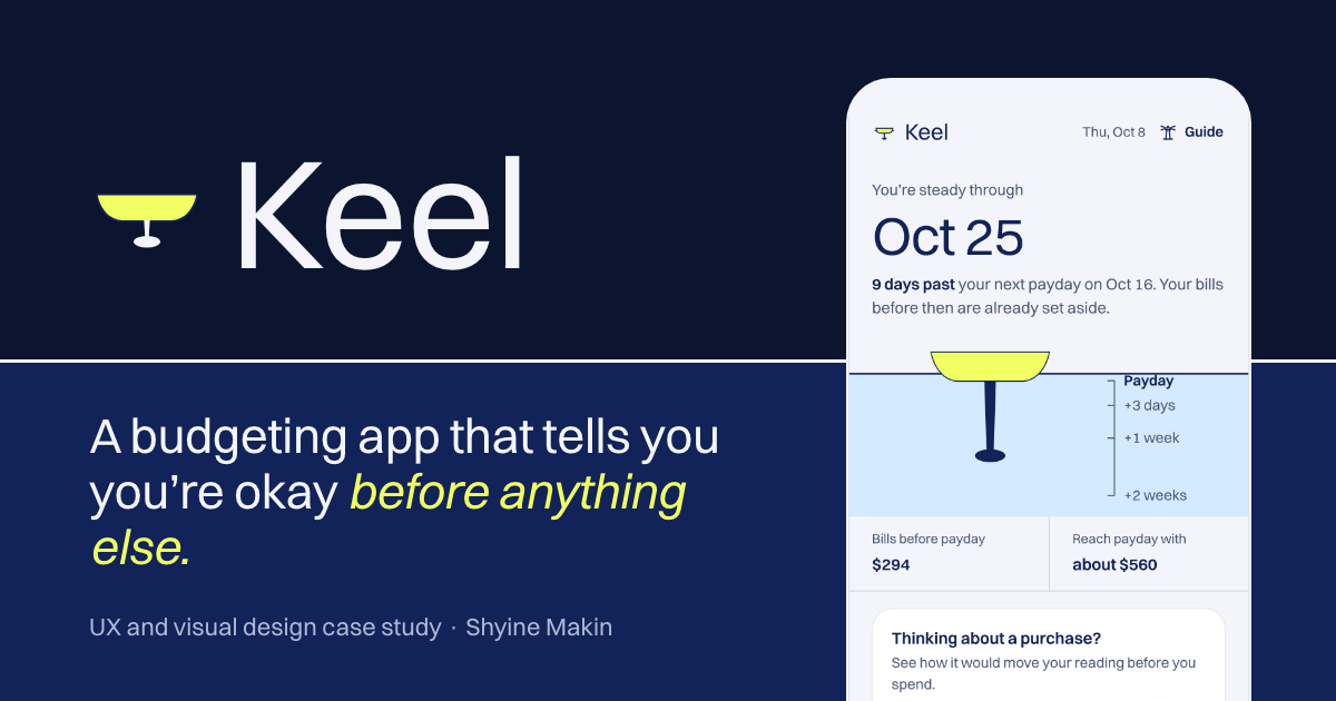
Problem
Limit-based budgeting triggers the “ostrich effect”: people avoid checking their money when it matters most.
My role
Solo: desk research, IA, wireframes, identity, design system, motion system and a working React prototype.
Outcome
A prototype with real calculations, 94 audited contrast pairings with none failing, and 16 animations written in code. Not yet user-tested.
- Role
- Everything, solo: research review to React prototype
- Team
- Solo
- Timeline
- 2026
- Tools
- Figma, React, Vite, Lottie, Rive, Python (asset authoring), Switzer
- Product Design
- UX/UI
- Design Systems
- Development
Concept project. Keel is a fictional brand and a self-directed concept. Research is a desk review of published studies; there were no interviews or user tests yet, and the personas are assumption-based. Numbers inside the prototype are labelled sample data.
1. The problem
Most budgeting apps are built around limits: category ceilings, over-budget alerts and red numbers. Published research on the ostrich effect suggests people look away from their finances exactly when things get hard, so those designs can work against their own goal.
Keel gives one forward-looking answer instead. The home screen shows a single date, drawn as a keel under a waterline that means payday.
2. Research, and its limits
- Desk review. Published work from the APA, CFPB and FP Canada, plus ostrich-effect studies, covering money stress in both the US and Canada.
- Competitor review. YNAB, Mint, Monarch and Copilot, from public sites, published methods and announcements.
- Proto-personas. Maya, Jordan and Priya: assumption-based and labelled as such, with no invented quotes.
What this is, and isn’t
No interviews or usability tests have been run. The testing section of the case study is a plan with proposed success criteria, not results.
3. Identity and design system
- Harbor & Signal palette. Extended from source palette MP174 by Alex Cristache with accessible greys, status colours and a dark theme. Signal Lime is the single accent.
- Status is never colour alone. Positive, negative, warning and info sets, always paired with a word or an icon.
- Shape language. A waterline, hull and keel motif, a 24px icon grid and a 1.75px stroke.
- contrast pairings pass WCAG 2.2, in both themes
- 94 / 94
- Source: Scripted audit, Keel case study
- home-screen colour weight after a measured layout fix (was 30/68/2)
- 64/34/2
- Source: Keel case study
4. Motion, written in code
The motion system has 12 Lottie animations, hand-authored as JSON through Python scripts, and 4 Rive state machines authored in code with a Python writer. Named motion tokens set durations for press, hover, card, chart and settle, and each one has a specified reduced-motion behaviour.
5. Building the prototype
- React + Vite. A working prototype with real calculations, in mobile and desktop views with a guided tour.
- Live charts. Four SVG charts driven by the prototype’s data.
- Performance budget. About 110 KB on first load. Lighter web versions of the Rive components are used; the Rive runtime loads only where it is needed.
6. Reflection
The reading ignores future income by design, which is a risk I flag in the case study. Irregular income is the open design problem I would take to research first.
 Next projectEAMA App & DashboardFrom phone calls and spreadsheets to one real-time platform